Mobile audit · April 2026
Care UK mobile site: what the audit found.
Six pages assessed on iPhone 12 Pro against the brief's seven dimensions: density, scroll depth, truncation, touch targets, layout shift, horizontal scroll, and typography. This is the diagnosis. It covers what's there today, where the problems concentrate, and the patterns that propagate across templates.
The six pages assessed
Each page audited against the brief's four dimensions: density & scroll, layout & truncation, navigation & touch, typography & readability. Click any page for the detailed breakdown.
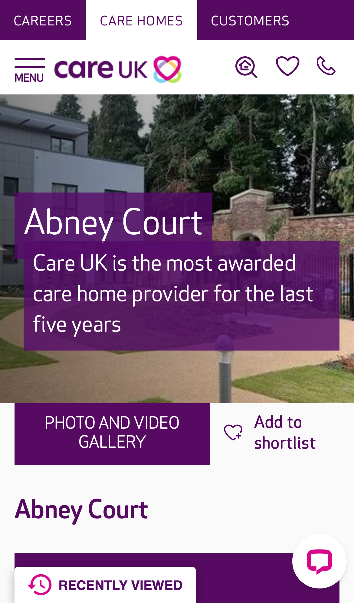
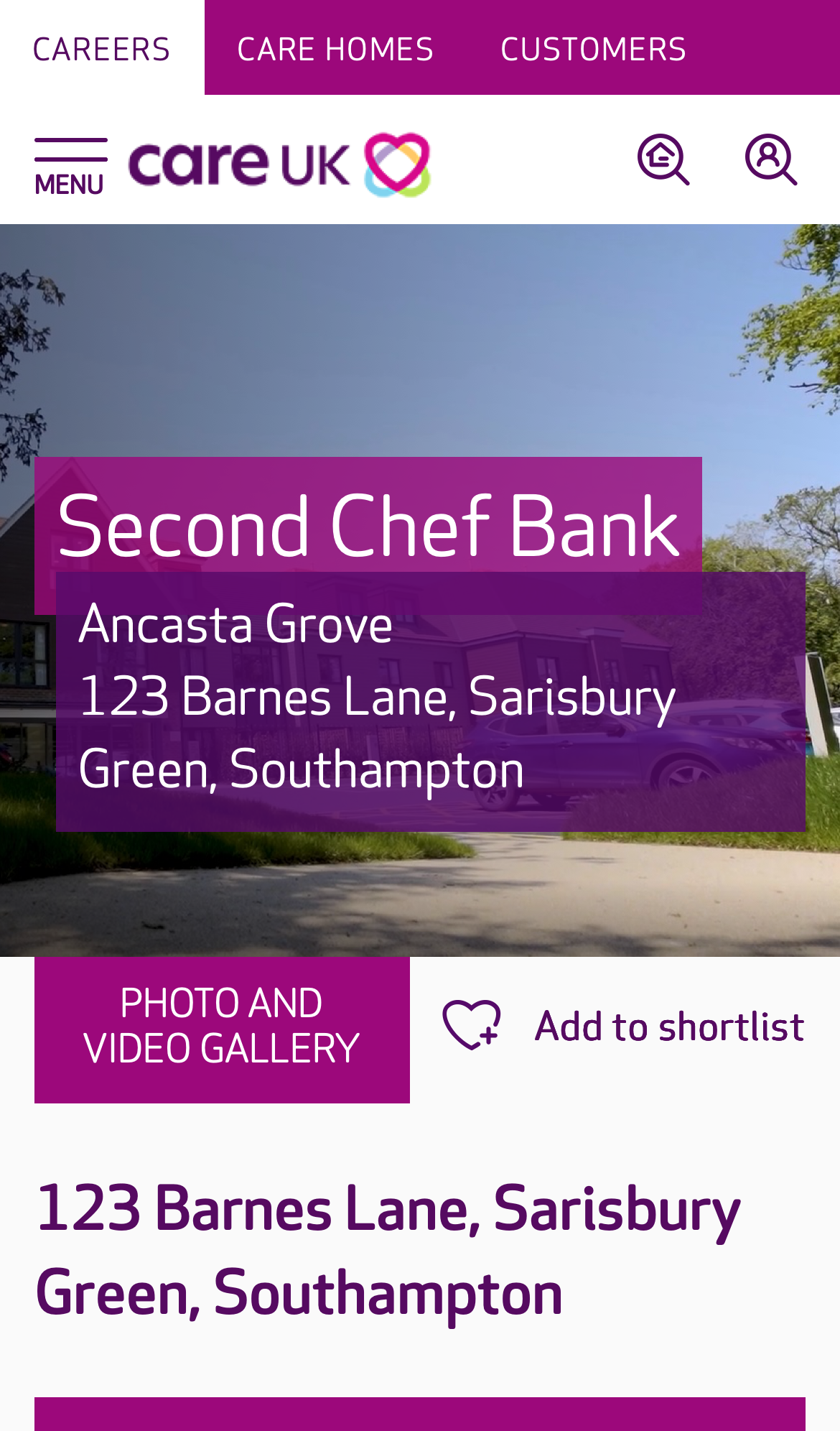
Care Home Detail
A prospective customer (or their adult children) is evaluating whether this home is right for a relative.
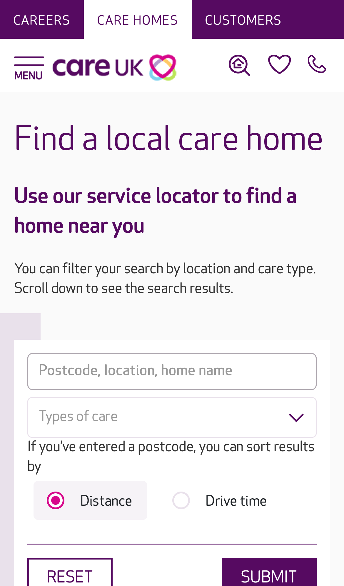
Care Home List
Find a Care UK home near a postcode, optionally filtered by care type, sortable by distance or drive time.
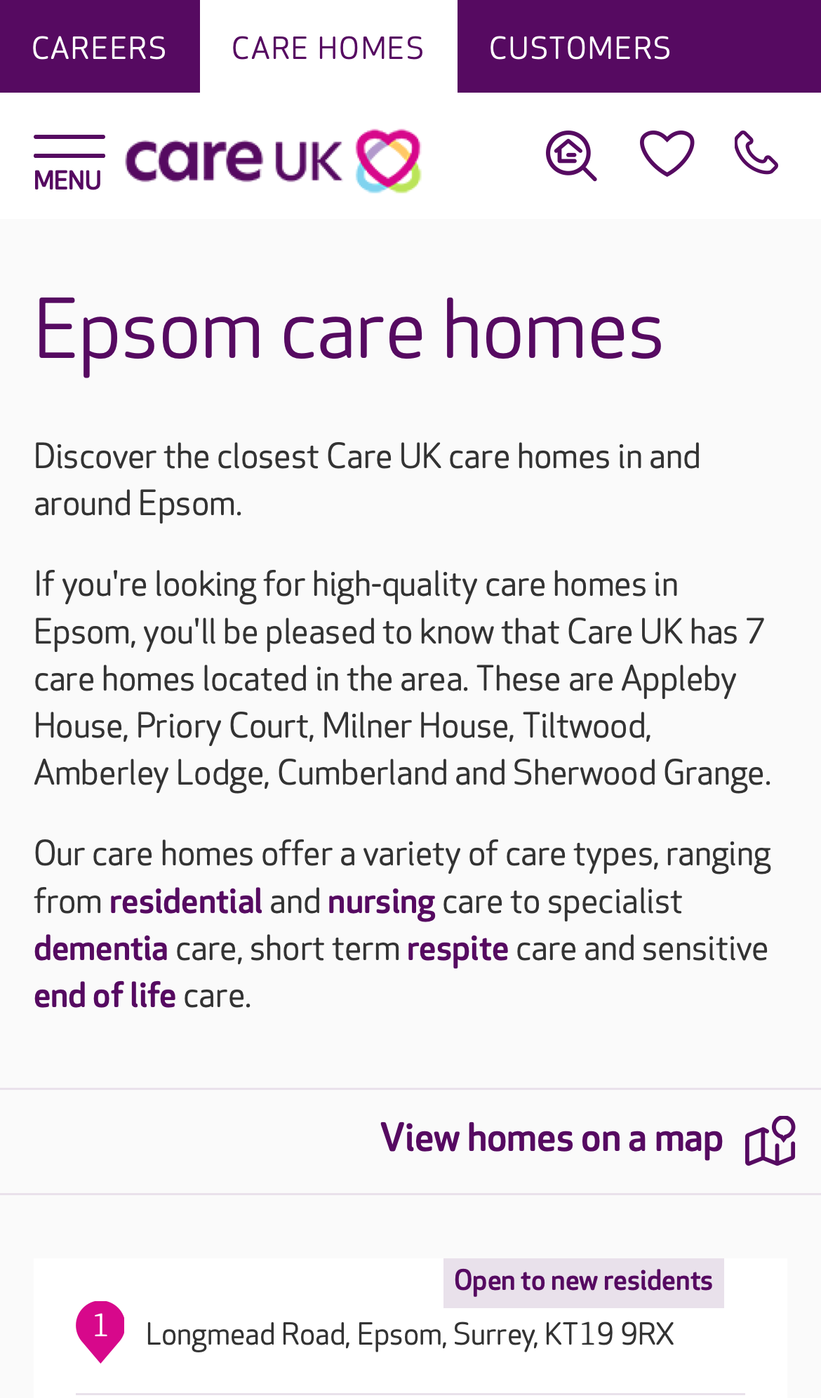
Promo Landing
Someone searching "Epsom care home" lands here and decides whether Care UK serves the area, and which homes are nearby.

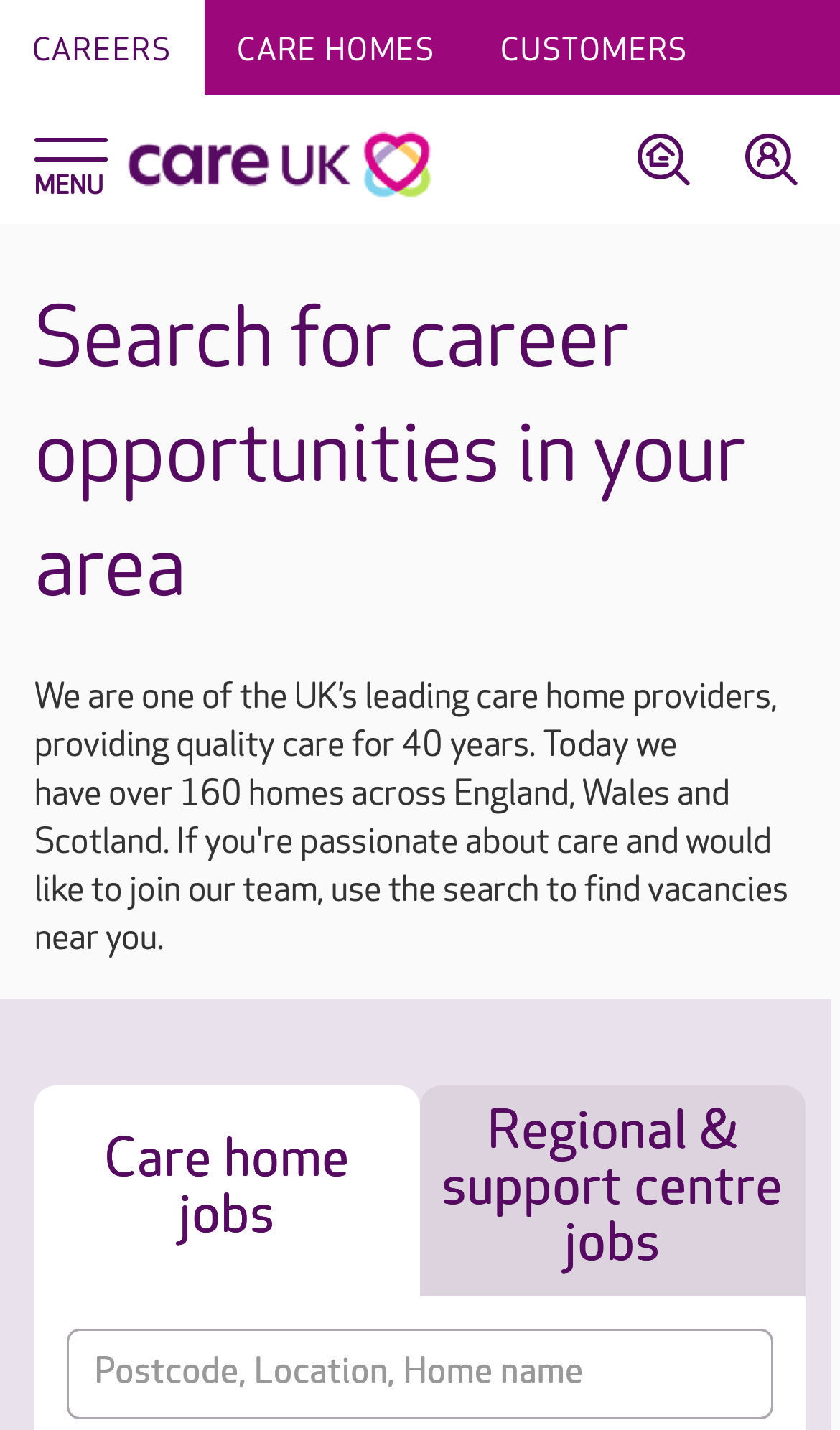
Careers Home
A prospective applicant, care assistant, nurse, hospitality role, wants to understand what working at Care UK is like and find a job to apply for.
Vacancy List
Find a Care UK vacancy near a postcode, optionally filtered by role type, sortable by distance or drive time.
Job Detail
A candidate has clicked through from the vacancy list and wants to read the role and apply.
Patterns that recur across pages
14 cross-page findings: issues that aren't unique to one template but propagate across multiple. These represent the highest-leverage problems in the audit. Browse all cross-page findings →
C-CARD-LIST.1 High density P02P03 3 Care-home result card is 1,000–1,200 px tall on mobile
Each card stacks a full-width image (~280 px), title row, CQC line, 7-row care-type matrix showing offered + not-offered services with similar visual weight, phone number row, and a full-width "VIEW HOME" button. Total ~1,000–1,200 logical px. The same template renders only one card per fold on a 844 px viewport.
Compact to ~300 px per card, side-image layout, `category-tag` chips for offered services, drop the per-card phone (it's on the home detail page). The `vacancyItem` template on page 05 already proves Care UK can build a compact card pattern (~70 px each).
card · category-tag
C-PANEL.1 High density P01 3 Inverse-purple section-intro panels are content-light, space-heavy
Each panel contains a heading + 2–3 line body + single CTA. Panel itself is 280–520 px tall on mobile. Across 8 instances on page 01 that's ~3.2 viewport heights of section-introduction chrome before any actual content is shown inside.
Replace the 8 inverse intro panels with default-surface `content-section` headings and inline CTAs. Restrict `.catalyst-inverse` to **one** block per page (typically the final CTA) so the dark surface remains an emphasis tool rather than the page's default skin.
content-section · inline-cta
C-CAROUSEL.1 High touch P01P04 3 Slick.js pagination dots are 20×20 px (sub WCAG AA touch minimum)
The dots are 20×20 logical px, below the WCAG 2.5.8 AA minimum of 24×24 px. They are the primary affordance for paginating image carousels on mobile, where swipe is the alternative but discoverability of swipe vs the dots is mixed.
Replace slick.js pagination styling with Catalyst-tokenised dot size (minimum 24 px hit target), or use chevron + thumbnail strip patterns from `image-gallery`.
image-gallery
C-CHAT.1 High layout P01P02P03P04P05P06 2 Two persistent bottom-anchored widgets compound on every screen
Two competing always-on bottom widgets reduce the effective scrollable viewport by ~80–200 logical px on every screen of content the user reads. WCAG 2.4.11 (Focus Not Obscured), content under a persistent widget cannot be focused without scrolling around it.
Per page:
- P01, Olark chat icon + Recently Viewed (2 widgets)
- P02–P03, Recently Viewed only
- P04, Recruiting Assistant + Recently Viewed (2 widgets)
- P05–P06, Recently Viewed only
Consolidate to one persistent action per page maximum, with a documented mobile safe-area inset. Olark vs Recently Viewed must be rationalised at the application layer. Use the `floating-action` composition pattern (system-level documentation, not a new component).
floating-action
C-IMG.1 High layout P01P02P03P04P05P06 2 77% of images across the audit are missing width / height / aspect-ratio
Images without explicit dimensions cause **layout shift** as they load, content jumps as the browser reserves space. This produces a poor Core Web Vitals CLS score (a Google ranking signal) and a janky perceived performance. The brief explicitly calls this out.
Per page:
- P01: 242 / 297 (81%)
- P02: 13 / 15 (87%)
- P03: 10 / 12 (83%)
- P04: 18 / 69 (26%)
- P05: 3 / 5 (60%)
- P06: 104 / 106 (98%)
Apply the existing `image` component (or `<picture>` with explicit dims) to all live image renders. The component already documents `width` / `height` props as required, with `aspect-ratio` as the mobile-friendly modern alternative.
image
What the audit covers
Issues unique to a single template: content prioritisation, hierarchy, page-only touch problems.
If every finding is addressed, Phase 2 reclaims about 40% of the scroll.
For context: total content height across the six pages is 58,636 px (91 viewports of scroll today). The estimated Phase 2 outcome, if the recommended fixes are applied, is approximately 34,900 px (49 viewports); a reduction of −40%. Every fix uses existing Catalyst components; zero new components required.
These projections are estimates derived from the audit data and per-finding impact assessments; they're a forward-looking signal, not a commitment. The audit deliverable itself focuses on the diagnosis above.