Mobile audit · April 2026
Care UK mobile site: what the audit found.
7 pages assessed on iPhone 12 Pro against the brief's seven dimensions: density, scroll depth, truncation, touch targets, layout shift, horizontal scroll, and typography. This is the diagnosis. It covers what's there today, where the problems concentrate, and the patterns that propagate across templates.
Roughly the equivalent of 34 phone-screens of scrolling could be reclaimed across the audited pages if these findings are addressed. An early estimate, not a commitment to a specific approach.
How to read the cards High density P01
Severity
How critical the issue is
- High Significant impact on usability or accessibility
- Medium Real issue, not a blocker on its own
- Low Minor or polish-level
- Note Informational, sets context for other findings
Dimension
Which area of the brief the finding falls under
- density Page length, scrolling, content compactness
- layout Layout shift, horizontal scroll, truncation
- touch Button / link / tap-target sizes
- typography Text size, contrast, readability
- navigation Wayfinding, primary actions, page hierarchy
- accessibility Heading structure, screen-reader behaviour
Page
Which of the six audited pages a finding applies to
- P00 Home Page
- P01 Care Home Detail
- P02 Care Home List
- P03 Promo Landing
- P04 Careers Home
- P05 Vacancy List
- P06 Job Detail
The 7 pages assessed
Each page audited against the brief's four dimensions: density & scroll, layout & truncation, navigation & touch, typography & readability. Click any page for the detailed breakdown.

Home Page
A first-time visitor is orienting themselves, deciding whether Care UK is the right organisation for their situation and which next step to take (find a home, learn about care, customer support, or careers).
+ 5 cross-page findings also affect this page
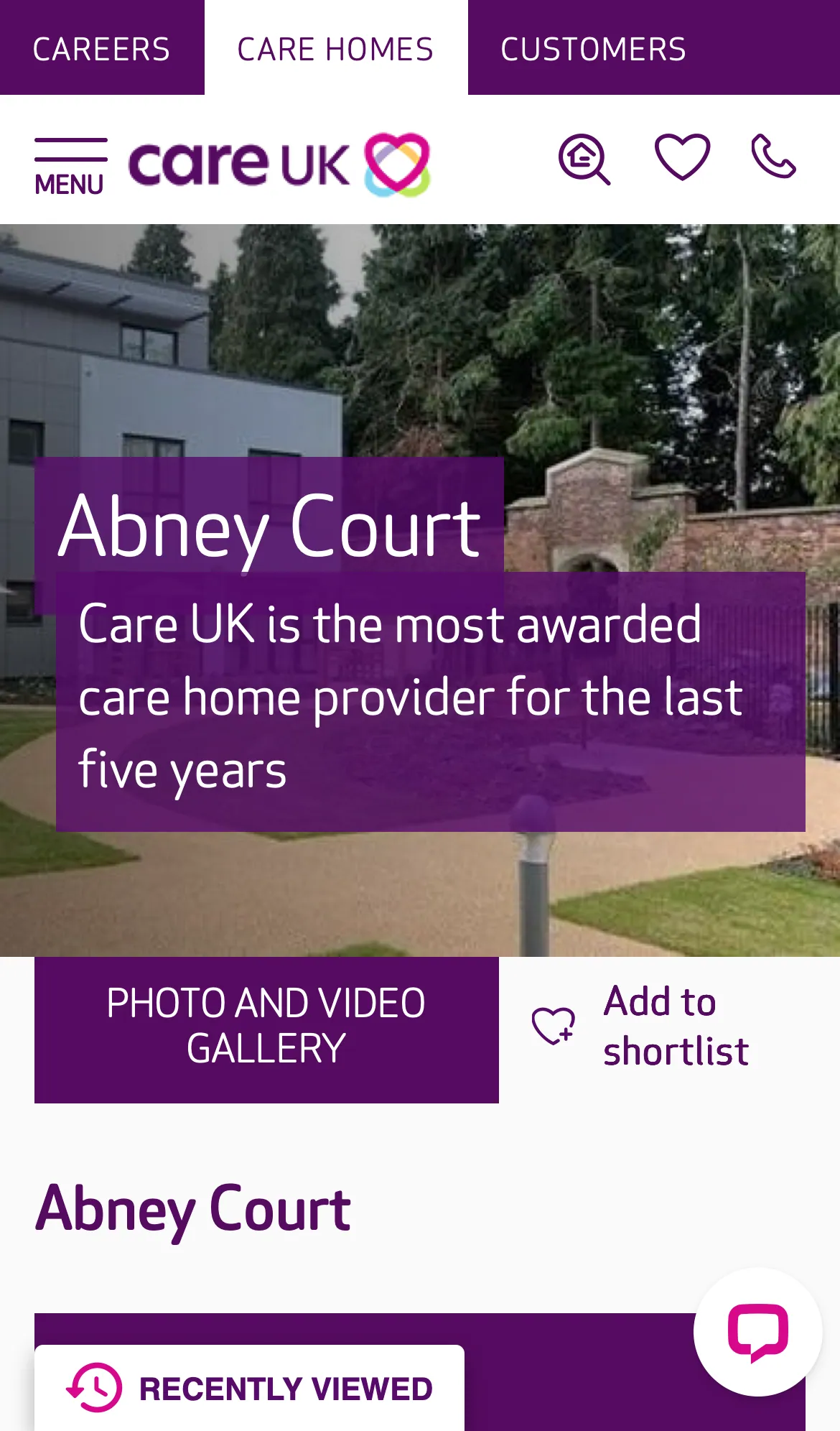
Care Home Detail
A prospective customer (or their adult children) is evaluating whether this home is right for a relative.
+ 9 cross-page findings also affect this page
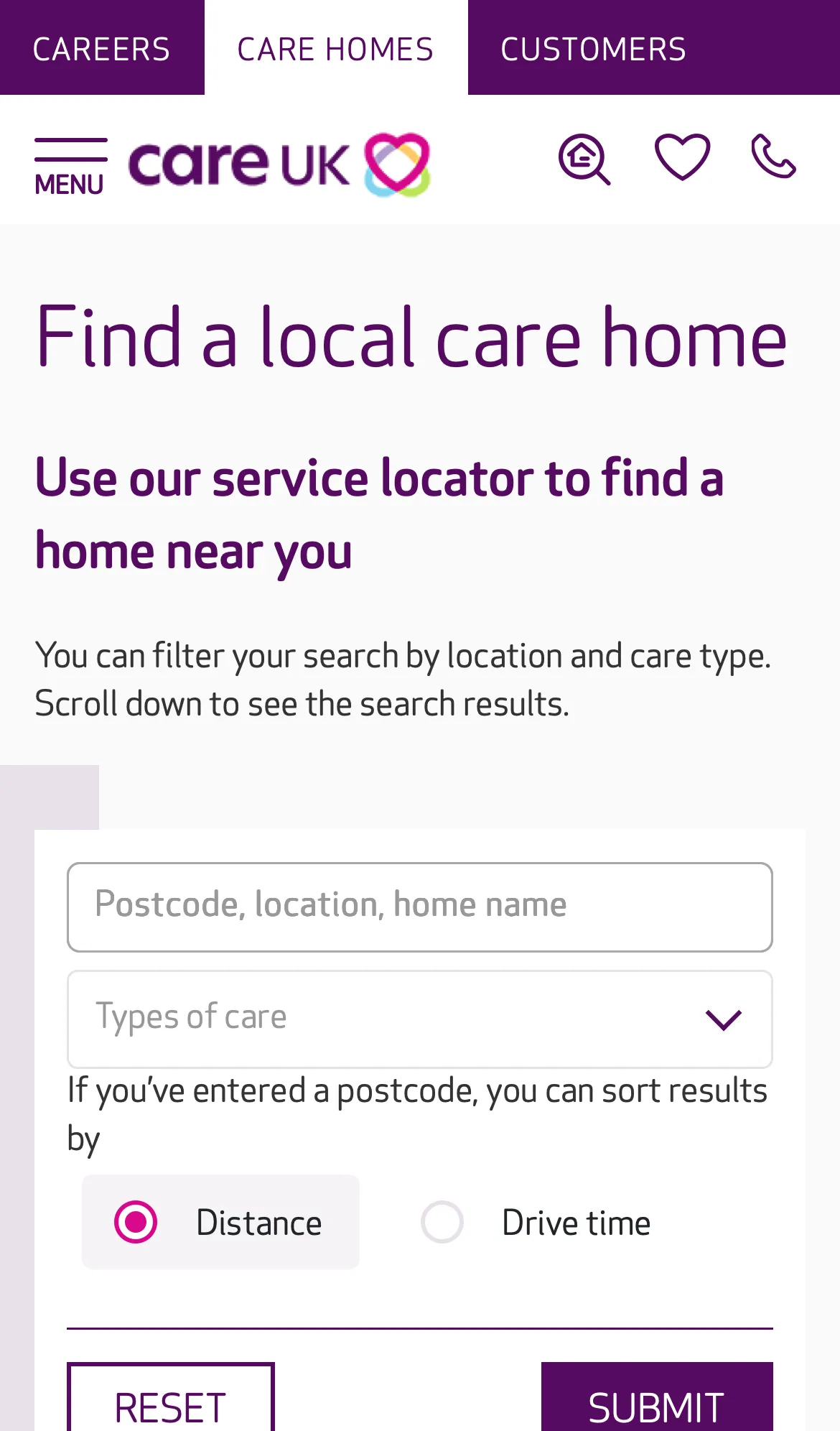
Care Home List
Find a Care UK home near a postcode, optionally filtered by care type, sortable by distance or drive time.
+ 8 cross-page findings also affect this page
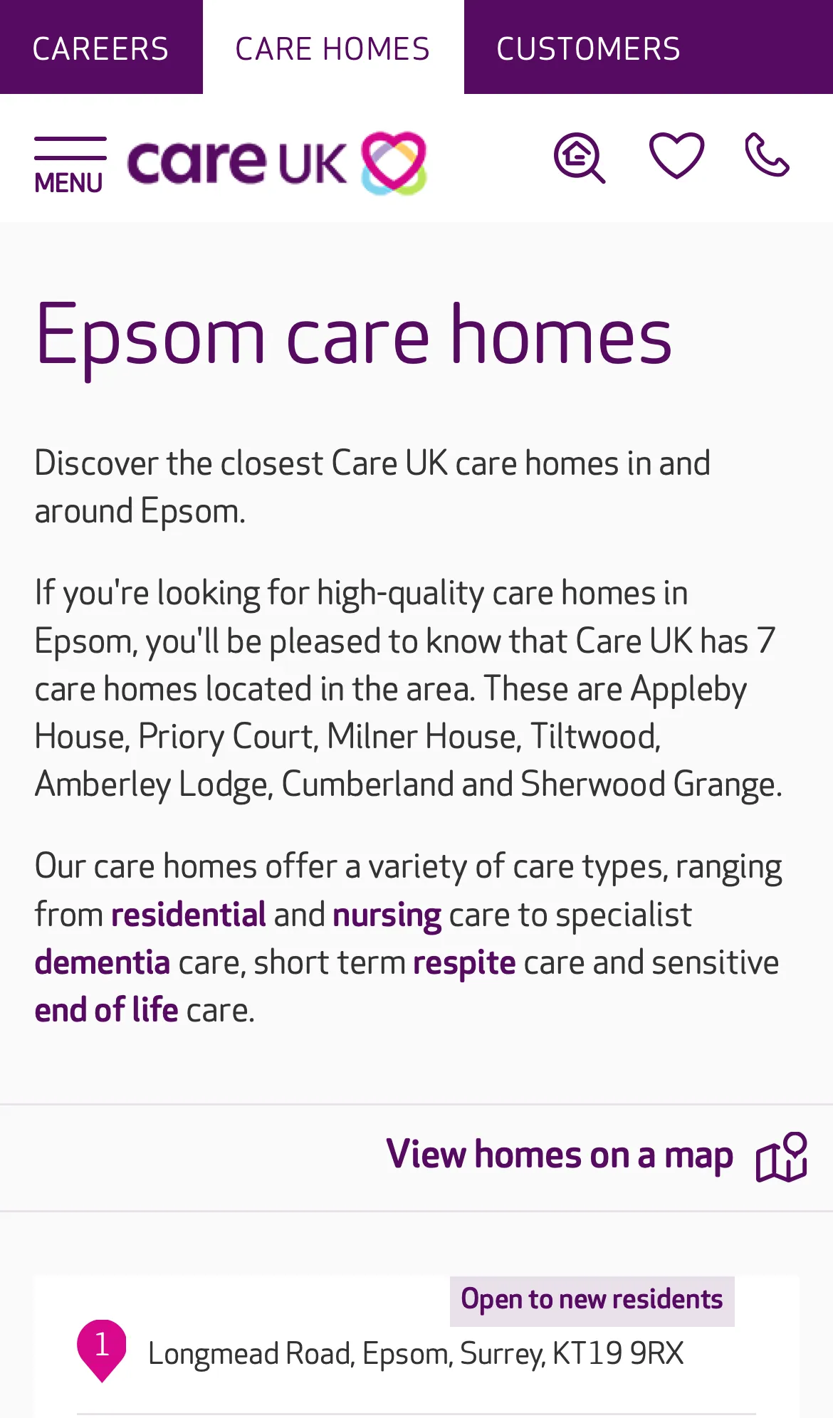
Promo Landing
Someone searching "Epsom care home" lands here and decides whether Care UK serves the area, and which homes are nearby.
+ 8 cross-page findings also affect this page

Careers Home
A prospective applicant, care assistant, nurse, hospitality role, wants to understand what working at Care UK is like and find a job to apply for.
+ 7 cross-page findings also affect this page

Vacancy List
Find a Care UK vacancy near a postcode, optionally filtered by role type, sortable by distance or drive time.
+ 6 cross-page findings also affect this page
Job Detail
A candidate has clicked through from the vacancy list and wants to read the role and apply.
+ 7 cross-page findings also affect this page
Patterns that recur across pages
11 cross-page findings: issues that aren't unique to one template but propagate across multiple. These represent the highest-leverage problems in the audit. Browse all cross-page findings →
C-ALIGN.1 High layout P01P02P03P04P05P06 3 Section components sit with inconsistent alignment to the page edges, breaking visual flow
Across the audit, several different section components on the same page render with mismatched left and right page margins. Some sit flush to the left edge with a wider right gutter; others reverse it; some sit roughly centred but with their inner content offset. On a mobile viewport where horizontal space is already at a premium, the result is a page that reads as misaligned. Each section starts at a slightly different horizontal position, the vertical rhythm down the page breaks, and the side with exaggerated padding wastes content area. Beyond the wasted space, the inconsistency carries a cognitive cost. Each new section asks the eye to re-anchor on a different horizontal axis. The user is constantly recalibrating where content begins and ends, which interrupts the natural top-to-bottom reading flow and adds friction to scanning the page. On a long page (the Care Home Detail page is 27 phone-screens deep), that friction compounds. The pattern is observable on the Care Home Detail page across the purple intro panels, the lighter-grey content cards, the Feature text panels (variants A and B), Care at our home, Reviews & Ratings, and the Nearby homes block. It carries over to the listing, promo-landing and careers templates, which inherit the same section components.
C-CARD-LIST.1 High density P02P03 3 Care-home result card is heavy on mobile (around 770–970 px tall per card)
Each card stacks a full-width image, a title row, a CQC line, a 7-row care-type matrix showing offered + not-offered services with similar visual weight, a phone number row, and a full-width "VIEW HOME" button. On P02 the template runs around 770 px per card (verified from heading positions); on P03 it's closer to 970 px because each card adds a description block. Either way, only about one card fits on the visible viewport at a time.
C-CHAT.1 High layout P01P02P03P04P05P06 2 Two persistent bottom-anchored widgets compound on every screen
Two competing always-on bottom widgets reduce the effective scrollable viewport by ~80–200 logical px on every screen of content the user reads. WCAG 2.4.11 (Focus Not Obscured), content under a persistent widget cannot be focused without scrolling around it. Per page: - P01, Olark chat icon + Recently Viewed (2 widgets) - P02–P03, Recently Viewed only - P04, Recruiting Assistant + Recently Viewed (2 widgets) - P05–P06, Recently Viewed only
C-CAROUSEL.1 High touch P01P04 3 Slick.js pagination dots are 20×20 px (sub WCAG AA touch minimum)
The dots are 20×20 logical px, below the WCAG 2.5.8 AA minimum of 24×24 px. They are the primary affordance for paginating image carousels on mobile, where swipe is the alternative but discoverability of swipe vs the dots is mixed.
C-IMG.1 High layout P00P01P02P03P04P05P06 2 71% of images across the audit are missing width / height / aspect-ratio
Images without explicit dimensions cause **layout shift** as they load, content jumps as the browser reserves space. This produces a poor Core Web Vitals CLS score (a Google ranking signal) and a janky perceived performance. The brief explicitly calls this out. Per page: - P00: 21 / 72 (29%) - P01: 242 / 297 (81%) - P02: 13 / 15 (87%) - P03: 10 / 12 (83%) - P04: 18 / 69 (26%) - P05: 3 / 5 (60%) - P06: 104 / 106 (98%)
What the audit covers
Issues unique to a single template: content prioritisation, hierarchy, page-only touch problems.
There's a meaningful improvement opportunity here.
Today, the user scrolls through 108 phone-screens of content across the 7 pages. The findings above point to patterns that, once addressed, would make the site feel substantially shorter and more direct on mobile, alongside resolving the touch-target and layout-shift issues.
How best to act on these findings is a separate conversation; the deliverable here is the diagnosis above.